
8 Famous Luxury Car Logos Explained
Crafting luxury car logos is an art. After all, consolidating the essence of a long-term investment, a status symbol, is no easy feat. Because, it’s not just about the huge investment involved, but also the diverse reasons why people choose luxury cars.
Some crave the raw performance these brands deliver. Some are in for the perceived value. To others, it’s all about their passion. So, a luxury car logo needs to capture such nuanced emotions and connect with the consumers at a deeper level.
In short, luxury car logos are more than just aesthetically elegant emblems. They are powerful symbols loaded with meaning. And today, we’re discussing how some luxury car brands around the world have mastered the art of branding.
Whether you are a marketer looking for some creativity inspiration or a car enthusiast curious about the story and meaning behind famous luxury car logos, this blog will break down these designs for you.
8 Iconic Luxury Car Logos & What Makes Them Great
1. McLaren
This British high-performance luxury sports car brand shows how sleek and minimalistic designs work in luxury car logos.
What stands out in this design is the swoosh-like symbol called “speedmark”. While simple and modern, the symbol manages to capture traits like speed and motion, which the brand stands for.
According to McLaren, this unique symbol was also created to tie back to the “vortices created by the rear wing of their cars”. Additionally, the symbol was also tweaked to appear similar to the “aggressive markings found on predatory animals and insects.”
In short, the design exemplifies how luxury car logos use symbolism in car logos to combine multiple meanings and tell a memorable story.
Finally, unlike many other high-end car logos that mostly use animals or crests, McLaren opts for abstract minimalism, setting it apart in the exotic car segment.
KIMP Tips:
- Instead of well-known symbols, create a custom abstract element to add layers of meaning that help your logo stand out.
- In addition to the symbol representing speed, the McLaren logo uses a bold display font that communicates prestige and differentiates the logo from the rest in the segment.
2. Lexus
Next on our list of luxury car logos is the well-known Japanese luxury car brand, Lexus. Like the McLaren logo, the Lexus logo also adopts the minimalist approach.
The sleek modern design features a stylized “L” within an oval, elegantly presenting the brand’s initial.
Like the McLaren logo, the Lexus monogram also packs a punch when it comes to interpretation. According to the brand, the design uses smooth and effortlessly flowing curves instead of rigid symbols, mainly to capture the streamlined curves and aerodynamic shape that Lexus cars are known for. In other words, the logo is created in such a way that it helps users instantly visualize the product design traits that set the brand apart.
KIMP Tips:
- Simplify with purpose – instead of using a cluttered logo with too many elements, combine shapes and typography to deliver the message clearly.
- Design with longevity in mind. Chic luxury car logos like the Lexus can easily stand the test of time and appear relevant to the brand.
3. Acura
The luxury automobile division of Honda, Acura, uses a unique combination logo. Like the Lexus logo, the Acura logo also looks like a stylized version of the brand’s initial. However, that’s not all.
According to Acura, the design was intentionally created to resemble the tip of a caliper, which is used for precise measurements. Similarly, the brand is known for its precision and attention to detail. This exemplifies the approach of identifying the brand’s purpose or philosophy and creating a logo that captures the essence of it.
A notable detail here is that, unlike its parent brand, Honda, which uses a simple, friendly “H” logo, Acura’s emblem is more angular, metallic, and modern. This design reflects a more refined approach to prestige car branding
Additionally, the unique geometric letterform of the brand typeface and the all-caps logotype together communicate sophistication and place Acura firmly in the luxury lane.
KIMP Tips:
- In case of sub-brands, it’s essential to use design cues to distinguish the brand from the parent brand and others under the umbrella.
- Blend style with sensibility and aim for a more practical design. Simple luxury car logos come in handy when it comes to the cohesive representation of the brand across touchpoints.
- Identify unique symbols that appeal to niche audiences. In this case, the use of a caliper reference sits well with the audience seeking luxury cars out of passion and to those who expect performance.
4. Cadillac
Cadillac, a renowned American luxury car brand, sways a little from the luxury car logos we discussed so far with its sophisticated crest logo. It carries a premium feel and instantly communicates elegance.
The current version of the Cadillac logo is a trimmed-down, minimalistic rendition of the original design inspired by the coat of arms of Antoine de la Mothe Cadillac.
As you can see in the image below, the design has undergone drastic changes, and the current version is a more modern and memorable version of the previous designs. One that’s aligned with the modern audience of today, with a different take on luxury.
To preserve the consistency of the brand’s identity, the design has evolved subtly with each edition, and the colors have been preserved most of the time. That’s why the logo in full color appears on cars in most cases, while a monochromatic version appears on digital channels and in corporate branding.
KIMP Tips:
- In addition to the distinct luxurious crest, Cadillac also uses a chic script typeface for the logotype, underscoring the significance of typography in making or breaking a logo’s vibe.
- When evolving your logo or modernizing it, thoughtfully eliminate unwanted details. But retain recognizable shapes that anchor the brand identity.
5. Ferrari
Ferrari, the Italian luxury sports car brand, has one of the most iconic luxury car logos well recognized across the world.
The logo features a horse, not just any horse, but a prancing horse symbolizing the versatility and strength of animal logos in branding. Besides, there is also a hidden meaning behind this black horse. According to the brand, it represents Count Francesco Baracca, a fighter pilot known to have painted the symbol on all his planes. The symbol was inspired by this design and added to the logo for good luck. Since then, it has remained a crucial part of the Ferrari brand identity.
The second visible detail in the Ferrari logo is the use of the Italian flag’s tricolor, paying homage to the brand’s origins. This demonstrates how colors can be used to amplify the meaning of a logo or add a different dimension to luxury automotive branding.
Finally, the premium serif font that captures the bold and rebellious nature of the brand! On the whole, every part of this luxury car logo has a purpose and emotion.
KIMP Tips:
- In contrast to most budget car brands, Ferrari’s logo doesn’t focus on a universal appeal. Instead, it’s designed to evoke emotions like power, exclusivity, and grandeur, which happen to be traits that people look for when purchasing luxury cars. Similarly, craft a design that appeals to your target audience.
- The Ferrari logo proves that colors play a crucial role in the effectiveness and impact of luxury car logos. So, choose your logo colors wisely.
6. Porsche
The German luxury and performance car brand also has a crest logo similar to Cadillac and features a prancing horse motif similar to Ferrari. Despite these similarities to other brands, this logo has carved a niche for itself in the luxury car logos segment because of its elegant design and the way the design ties back to the origins of the brand.
The Porsche logo is a complex, heraldic crest made up of elements from the Stuttgart coat of arms (the prancing horse in the center) and the state of Württemberg’s old emblem (the antlers and red-and-black stripes). This multi-layered design is packed with elements representing regional pride and symbolizing performance.
To highlight the difference even more, Ferrari’s horse is the central element set against a bold yellow backdrop, evoking passion and personal legacy. Besides, it looks modern. On the other hand, Porsche’s horse is one element within a more formal crest, embedded in historical symbolism. This gives an extra depth to the logo’s meaning, showcasing the power of car logo symbolism in capturing a brand’s legacy.
KIMP Tips:
- The Porsche logo is another great example of the importance of color psychology in luxury car logos. The gold, red, and black colors add a touch of opulence and power.
- Incorporate regional and historical symbolism to establish a sense of heritage and connect with your customers through meaningful stories.
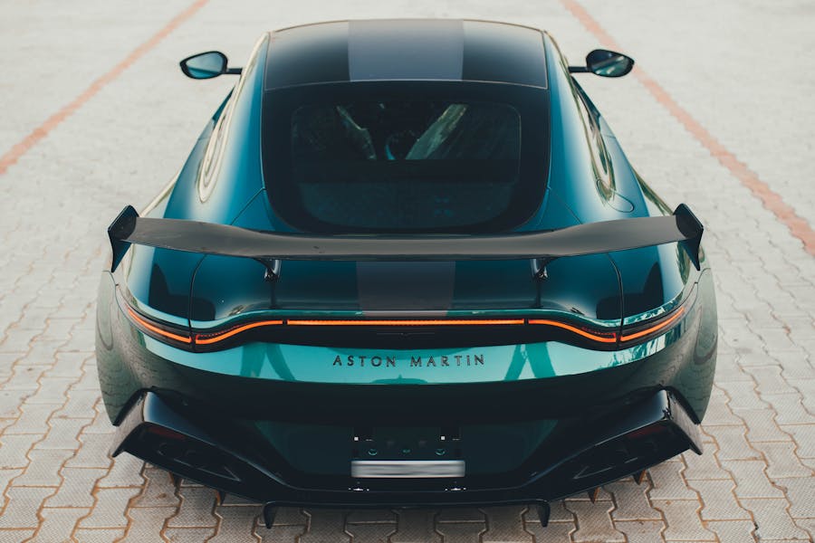
7. Aston Martin
Aston Martin, the popular British luxury car brand, has an elegant and timeless logo design. It features wings, a universally recognized symbol of freedom and speed. In short, this design gives a gist of what the brand promises to deliver!
As you can see, the Aston Martin logo is different from the minimalist approach of Lexus and McLaren, as well as the detail-oriented approach of Ferrari and Cadillac. Instead, it opts for a clean and straightforward representation that still exudes luxury.
One of the main design aspects that adds to the aesthetic appeal of the Aston Martin logo is its visual balance, derived from the symmetric design.
Besides, if you observe the cars from Aston Martin, you might notice the understated opulence that distinguishes them from other luxury car brands. The winged logo of this brand effortlessly aligns with this trait because it’s ornate but not overdone or cluttered.
The image below shows the evolution of the Aston Martin logo and how the brand has managed to preserve the core elements that represent the brand’s spirit, to rebrand without losing recognition.
KIMP Tips:
- Use metaphoric shapes—like wings—to tell a brand story without relying on text. Some brands also find bird logos and animal logos to be useful for such metaphoric but relatable representations.
- Want to evoke a sense of prestige? Pay attention to the visual appeal by focusing on visual balance, hierarchy, and contrast in design.
8. Bentley
Without simplifying the overall design for mass appeal, Bentley uses an elaborate design. The winged B logo of Bentley is definitely a stunner among all luxury car logos. Like the Aston Martin logo, this one also uses a metaphorical representation of speed through a pair of wings in the design.
But in addition to the connection between wings and speed, the design was also intentionally chosen to reiterate the brand’s founder W. O. Bentley’s early career as a fighter pilot. That’s a brilliant way to tie the brand identity back to its roots and its founder to strengthen its significance.
Aligning with the modern luxury car segment, the brand uses a sleek sans-serif font, contrasting with the traditional serif used by Ferrari or the posh script used by Cadillac. This depicts the effectiveness of typography in differentiating the brand in a competitive space.
KIMP Tips:
- Ensure that the typography in your logo resonates with your brand’s distinct personality.
- The Aston Martin logo and the Bentley logo both use wings to represent the brand’s core focus however, the former uses a more angular and structured design, whereas the latter uses a more curvy and smooth design. Similarly, tweak subtle details to ensure that your logo stands out even when you use commonly used references.
Ready for a Logo That Drives Results? Get KIMP!
In essence, the luxury car logos on our list demonstrate the power of a thoughtful design in communicating what the brand exactly stands for; in this case, it’s luxury, performance, or heritage. So, if you are looking to inject such nuanced design details into your branding as well, now is the time to invest in a long-term design solution, like KIMP!
With an unlimited design subscription, you can perfect all your brand designs, starting from your logo, with expert creativity on demand at a flat monthly fee.
Register now for a free 7-day trial to understand how unlimited design can transform your design workflow.